AI microservices diagram generator.
The interesting question is never how many services there are, it is which ones cannot be deployed without the others.
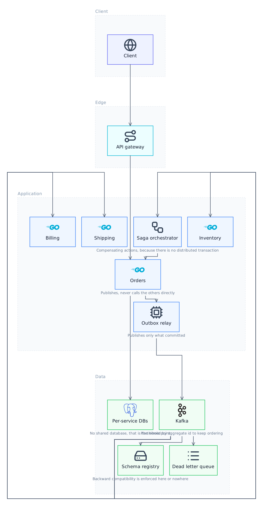
What a microservices diagram should show
Services, what each one owns, and the difference between a synchronous call and an event. That last distinction is the one that matters and the one most diagrams omit: a synchronous call is a runtime dependency that fails together, and an event is not. Drawing both as identical arrows loses the only information that predicts how the system behaves during an incident.
How Lucid Train draws one
Describe what you want, or point it at a repository. The agent emits a semantic graph of nodes and edges with no coordinates, and the ELK layout engine computes positions and orthogonal routing. That separation is the reason the output cannot come back with boxes overlapping or arrows crossing through cards, which is the characteristic failure when a language model is asked to place things on a canvas itself. It also means editing is editing the graph: change a component and the layout re-solves rather than drifting out of alignment.
Data ownership is the real boundary
The test of a service boundary is whether it owns its data. Two services sharing a database are one service with a deployment problem, and drawing the data each service owns makes that visible immediately. It is also the diagram people most resist producing, because it tends to show that the boundaries are not where the org chart says they are.
Finding the distributed monolith
A cycle of synchronous calls between services means none of them can be deployed or fail independently, which is the specific failure the architecture was adopted to avoid. Cycles are visible on the drawn graph and close to invisible when reading service code one repository at a time.
Local, offline, your models
It runs as a desktop application. Against a local Ollama model the whole thing works offline with no API key and no telemetry, which is the practical difference from every browser-based diagram tool: your architecture never leaves the machine.
Edge types worth distinguishing
| Edge | What it implies |
|---|---|
| Synchronous call | A runtime dependency: the caller fails when the callee does |
| Published event | No runtime coupling; the consumer may lag |
| Shared database | Not a boundary at all, whatever the diagram says |
| Saga step | A workflow needing compensation on failure |
| Read model projection | Eventually consistent by construction |
| Batch or scheduled | Coupled by data rather than by request |
Try it
Questions
Can it diagram microservices across several repositories?
One at a time, then combined by describing the whole. There is no automatic discovery across repositories, since nothing in one repository reliably names the others.
Will it distinguish synchronous from asynchronous edges?
Yes, and it is worth insisting on, since it is the distinction that determines how the system degrades.
Can it help decide where to split a monolith?
It can show you the current coupling, which is the input to that decision. The decision itself depends on team structure and change frequency, neither of which is in the code.
How many services is too many for one diagram?
Past fifteen or so it stops being readable, and the answer is to draw domains at one level and expand each separately rather than to keep adding boxes.
Related
- AI Database Schema Diagram GeneratorThe physical view: tables, columns, keys and indexes, for when you need what is actually stored rather than the conceptual model.
- AI Infrastructure Diagram GeneratorWhere things run, what can reach what, and which boundaries the traffic crosses on the way.
- AI Architecture Diagram GeneratorDescribe the system, or point it at the repository and let it find out for itself.
- AI System Design Diagram GeneratorFor a design doc, a review, or the whiteboard round where you have forty minutes and need the shape to be right.
Last updated