AI data flow diagram generator.
Where the data comes from, what transforms it, where it lands, and which of those crossings leave your control.
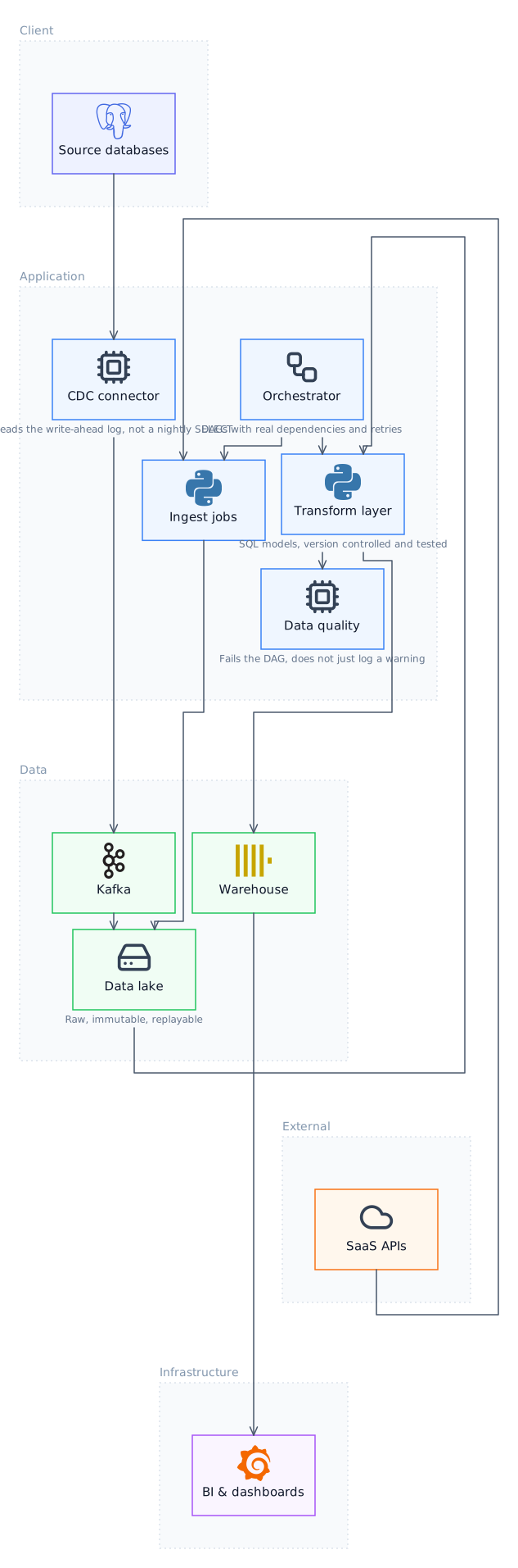
What a data flow diagram shows
Four things only: external entities that supply or consume data, processes that transform it, data stores that hold it, and the flows between them. Deliberately no control flow and no ordering, which is what distinguishes it from a flowchart. The discipline of that restriction is the value: it forces the question of where data actually goes, which is easy to lose in an architecture diagram full of services.
How Lucid Train draws one
Describe what you want, or point it at a repository. The agent emits a semantic graph of nodes and edges with no coordinates, and the ELK layout engine computes positions and orthogonal routing. That separation is the reason the output cannot come back with boxes overlapping or arrows crossing through cards, which is the characteristic failure when a language model is asked to place things on a canvas itself. It also means editing is editing the graph: change a component and the layout re-solves rather than drifting out of alignment.
Trust boundaries are the reason to draw one
The most useful annotation on a data flow diagram is where a flow crosses out of your control: to a third party, out of a region, from an internal network to the public one. Those crossings are where privacy obligations and security review attach, and a diagram that marks them is doing something no architecture diagram does.
Levelled, not exhaustive
A context-level diagram treats the whole system as one process with its external entities around it, and lower levels expand a single process. Trying to draw every flow at every level in one picture is the standard way these become useless. Each level should fit on a page and answer one question.
Local, offline, your models
It runs as a desktop application. Against a local Ollama model the whole thing works offline with no API key and no telemetry, which is the practical difference from every browser-based diagram tool: your architecture never leaves the machine.
Data flow diagram notation
| Element | Meaning |
|---|---|
| External entity | A source or destination outside the system boundary |
| Process | Something that transforms data |
| Data store | Somewhere data rests |
| Data flow | Data moving, labelled with what it is |
| Trust boundary | Where data leaves your control |
| Level 0 (context) | The whole system as one process |
| Level 1 and below | One process expanded into its parts |
Try it
Questions
Is a data flow diagram the same as a flowchart?
No, and confusing them is the usual mistake. A flowchart shows control flow with decisions and ordering; a data flow diagram deliberately has neither. If your diagram has a decision diamond, it is not a data flow diagram.
Is this useful for threat modelling?
It is the standard starting point. STRIDE is applied per element and per boundary crossing, so having the boundaries drawn accurately is most of the preparation.
How many levels should there be?
Usually context plus one, occasionally two. Beyond that the diagram is describing implementation, and code is a better description of implementation than a diagram is.
Can it generate one from code?
It produces a draft from the data access and external calls it can see. Expect to add the flows that happen outside the code, which are often the ones a privacy review cares about most.
Related
- AI C4 Model Diagram GeneratorOne system, drawn at three levels of zoom, so each diagram has one audience instead of trying to serve all of them.
- AI Flowchart GeneratorFor a process with decisions in it, where the question is what happens next rather than what talks to what.
- AI UML Diagram GeneratorIn practice teams use about four of UML's fourteen diagram types, and this draws those four properly rather than all of them badly.
- AI Cloud Architecture Diagram GeneratorRead your infrastructure as code and draw it, with the real service names and no cloud credentials required.
Last updated